
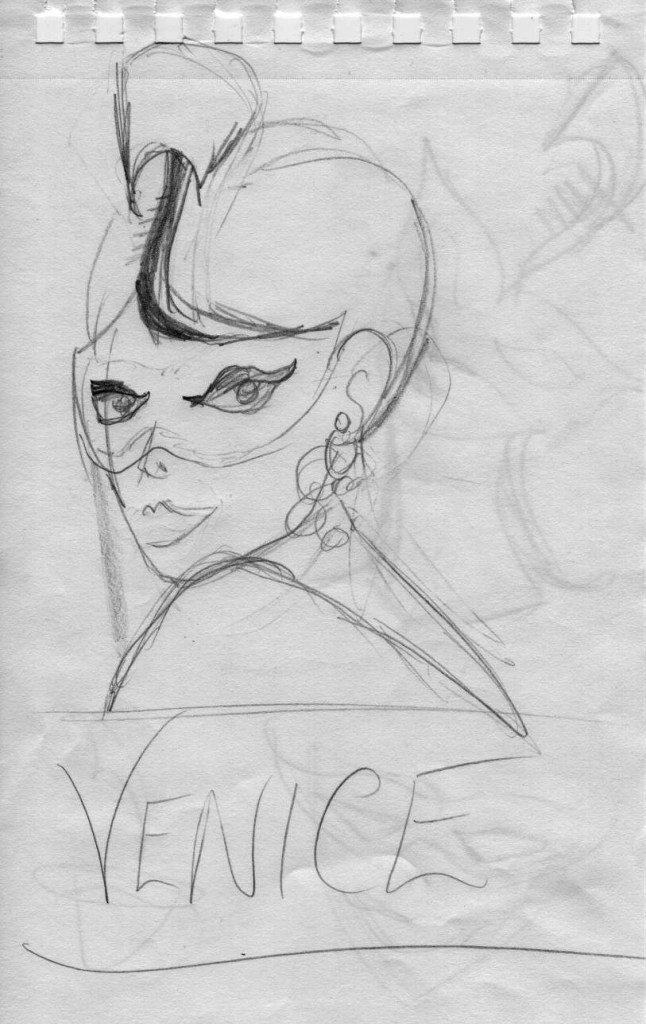
For the Venice edition, I knew I wanted a similar look to the Rome book, a woman sporting a hat that symbolized the city, since it’s a series. I also wondered if I should add a mask, this being Venice. So I drew some rough sketches.
This first one looked promising, but the mood wasn’t right. She felt more ‘come-hither’ than joyful. Also that “ferro” looked more like a cobra than a gondola prow, giving her a Cleopatra look.
The second one definitely had more joy and it meant I could use a similar pose as the one for Rome.

I opened Adobe Illustrator and got to work. I re-used the base illustration from the Rome cover, but gave her red hair. I tried long flowing locks but it wasn’t working. Drawing hair is definitely not my strength. So I decided to go with the short bob instead. This felt much more fun.
Then I added a lace mask in black. But when the cover was reduced to postage-stamp size, (which is how small it would display alongside other books on Amazon), she looked like she’d had a full face tattoo. Yikes. Even when I tried the mask in different colours, including white lace, it was difficult to make out what the cover was at a small size. So, the mask had to go.
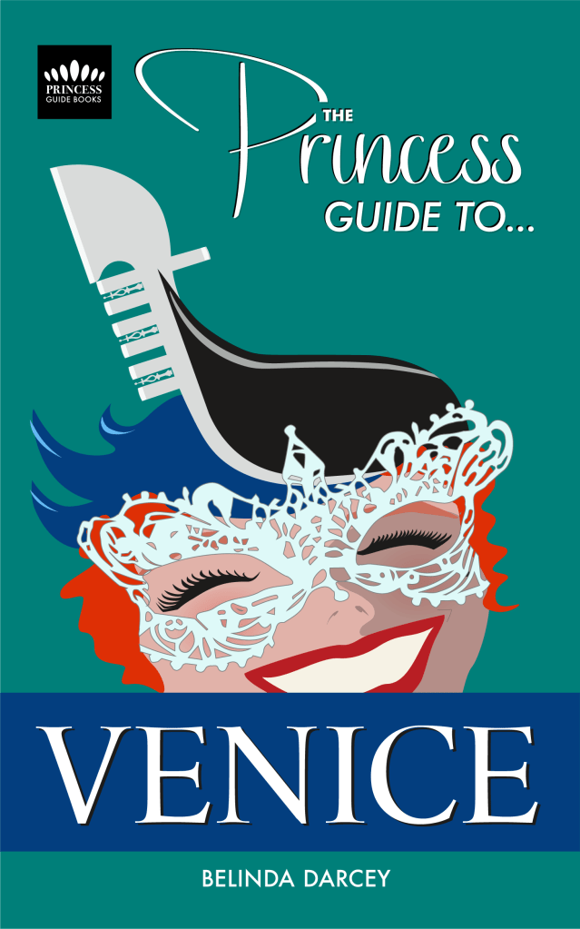
Here is the final cover, no mask just a face beaming with joy. I decided to make the hat fancier and more like a real ferro. Each prong, including the ornate ones has symbolic meaning in Venice. You’ll have to read the book for that story. Here’s hoping she appeals to lots of readers.

